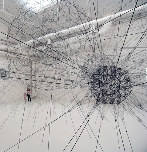
This piece, made of elastic ropes, is called Galaxies forming along filaments, like droplets along the strands of a spider's web and is featured in one of the curated shows at the Venice Biennale.
More photos here

This piece, made of elastic ropes, is called Galaxies forming along filaments, like droplets along the strands of a spider's web and is featured in one of the curated shows at the Venice Biennale.
More photos here
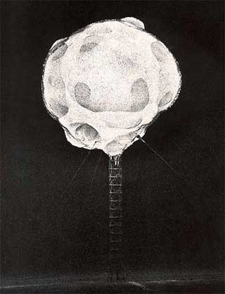
I've been reading Terry Winters: Paintings, Drawings, Prints 1994-2004
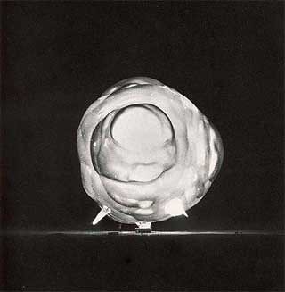
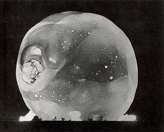
The photographs were taken by Harold Edgerton at night with an extremely fast a shutter speed and a special 10 feet long lens which was set up in a bunker 7 miles away. These 3 pictures show the first 3 milliseconds of an atomic bomb detonation. The bomb was at the top of a steel gantry anchored to the desert floor.

Untitled, 1970

About a year ago I wrote a post about a Michael Asher installation at the Santa Monica Museum of Modern Art. For the installation Asher reconstructed, as open frameworks, all of the temporary walls that had been constructed for the museum 44 previous exhibitions (picutred above).
I noted at the time that it reminded me of an old idea I had discarded invloving mapping all of the artworks that had been exhibited in an exhbition space. A Dutch artist named Willem Besselink has just seen the post and lef t a comment to say that in 2007 at a gallery called Moire in Utrecht he had done something very similar. His project involved constructing framewoks outlining the space occupied by all of the artworks exhibited in a gallery during the previous year. The video below documents the construction and dismantling of the piece. The different colours relate to the different exhibitions.
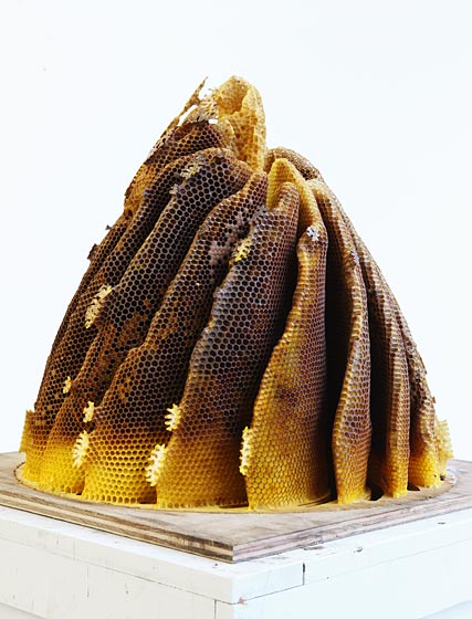
Hilary Berseth makes sculptures with bees by placing armatures in their hives. I blogged about his work before ages ago but it has just been featured on Makezine where they've linked to this article on nymag.com which features a slideshow of images showing the process.
Someone in the comments section of the nymag article posted this link to the work Aganetha Dick who encourages bees to build honeycombs on figurines and other objects:


Jorge Macchi is an Argentinean artist who makes work in a range of different media. The piece below is a disco ball in an empty room with holes crudely punched in the walls, floor, and ceiling to allow the reflected light to escape. It was featured in The experience of art, curated by Maria de Corral for the 2005 Venice Biennale.

More at http://www.jorgemacchi.com
I've read a few articles about (and looking at images of) Arte Povera recently which has been getting some press due to a rehang of a wing of Tate Modern. Here are a couple of nice sculptures by Guissepe Penone (top) and Michelangelo Pistoletto (bottom). I can't find caption info online.


The title of this post was taken from a postcard found by the American artist Zoe Leonard. It is also the title of Leonard's exhibition at Dia Beacon which comprises approximately 4000 postcards of Niagara Falls, dating from the early 1900s to the 1950s that the artist collected in flea markets and online auctions.
En masse, they reflect decades of changing technologies during which the motif of the Falls, shot from a few standard vantage points, was revisioned: hand-colored, over-painted, cropped, or otherwise manipulated in accordance with changing notions of truth and taste.
More info here
I was listening to a podcast about the Altermodern exhibition at Tate Britain and the curator mentioned a piece by Walead Beshty which involved shipping laminated glass cubes which were cracked in transit. It reminded me of a piece which I saw a couple of years ago which I find more interesting. The piece is by British artist Tim Knowles which is described in his own words below:
A digital camera inside a parcel looks out through a small hole and captures images of its journey through the postal system. The Spy Box was sent from my studio to the gallery taking an image every 10 seconds recording a total of 6994 images these were then edited together to create an animated slideshow.
Below is a short clip from his website which is found here.

Above is the film work So This Is by Michael Snow from 1982 from UBU.

Here is a sculpture called Grub by Aaron Kramer. It is made of used coffee stirrers (top) and used bristles from street sweeping brushes (bottom) woven on a steel armature. I was particularly interested in this work because I have been collecting bristles from street sweeping brushes that have come loose and scattered on the street. Aaron gets his bristles from a company who replace the bristles on worn out brushes.
Here is some of his work on the Packer Schopf Gallery website.
Here is his own website.
The New York Public library have a great selection of images from their picture collection available online available for research and non-commercial use.
For those who seek knowledge and inspiration from visual materials, the Picture Collection Online presents more than 30,000 digitized images from books, magazines and newspapers as well as original photographs, prints and postcards, mostly created before 1923.
Click here for the Picture Collection Online
The video above features a sculpture of a fullstop by Fiona Banner in London. It comes from The Centre of Attention's youtube channel.
Artbabble is a website set up by the Indianapolis Museum of Art to show videos on art. The site includes videos from various contributors including MOMA and Art21 but some of the most interesting and longer videos were produced by the IMA themselves. Update: There was an article in the Guardian which calls this a youtube for fine art which of course it is not as it features videos provided by institutions and not user generated content. Also while this is still a good idea quite a lot of the content is already available on youtube. Hopeful they will branch out to include more partners and longer videos from contributors like art 21.
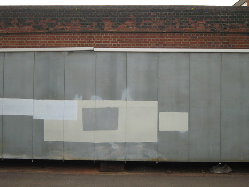
Here is an excerpt from an article titled 'Critical Terms For Graffiti Study' writen by Caleb Neelon. It deals with the practice of graffiti removal known as buffing. The full article is here
Buffing means removing graffiti. Originally, this referred to the caustic chemical drive-through car wash that was devised for the New York subways. Writers now refer to any piece that has been taken from view by the authorities as "buffed." The original buff was an acid solution that left the subway cars a muddy mess - as opposed to a freshly painted car. Repainting the subways looked better, but the expedient buff, which smeared the tags and pieces beyond recognition, was perhaps cheaper, and prevailed. Later generations of New York';s subway cars were made from stainless steel, so as to be buffed more easily.
Cities take different approaches to taking graffiti from public view. I say "taking from public view" because in most cases, the graffiti is not removed, but painted over with a drab, standard color. Most cities pick one such color and stick with it - for example, Boston uses a light slate blue gray. New York City uses a burgundy. Chicago uses a pale brown. What these colors have in common is that they are arbitrary, ugly, and institutional: I imagine that some city must use the palest of greens, in chromatology the most placative and sedative of colors, and thus used in most prisons. These buff colors are also uniformly great surfaces for further graffiti. Cities rarely have a precise and specific color specified, but instead utilize various shades of their buff color. The result on frequently co-targeted walls is a kind of collage of different tones; a patchwork quilt of action and reaction.
Graffiti writers have taken this dynamic into consideration for years. The buff squads need graffiti to clean up to continue their livelihood, and graffiti writers, in an odd variant of the hostage/hostage-taker fondness called the Stockholm Syndrome, often need the buff to free up wall space again, get angry and motivated, and to keep things challenging and interesting. Many writers who engage in studio work will partially "buff" their own work as part of the final product. The reappropriation of the buff into something which can be sold is a fine last laugh at the authorities.
It's a strange experience to drive or ride the train through cities with a prominent buff and see a certain, arbitrary color so dominate its landscape. For instance, the burgundy of New York, the pale blue of Boston, and the pale brown of Chicago hold no special places in the hearts of their citizens. They aren't civic or sports team colors, nor do they refer to some special color of the genius loci, e.g. green in Ireland. The color of the urban buff is the arbitrary shade of officialdom in the city.
Invoke Street Art is a project that aims to tackle vandalism by covering traffic signal utilty boxes in Dublin with artwork printed on vinyl. The artwork is mostly done by local designers and illustrators. The other day I saw one of these (pictured below) had been vandalized by a graffiti writer who added the word "fags" and I'm inclined to agree with the sentiment though not the use of a homophobic slur (It has since been repaired).
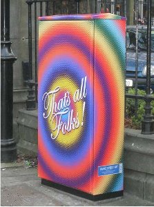
There are certain places in a city like utility boxes, the backs of signs, and hoardings around building site where tagging, stickering, and stenciling is relativley unobtrusive and it is reasonable to turn a blind eye to it when it is confined to these kind of locations. The problem of graffiti is not one that is ever going to go away. When you take these kinds of spaces away from the street artists you simply force them to use other spaces like walls, shop fronts etc. Far from providing an outlet for art the project takes away an unofficial outlet for creative expression replacing it with bland, apolitical, officially sanctioned illustration.
I would also be concerened that if this project is deemed a success it will simply pave the way for these boxes to be sold onto JC Decaux or some other company as advertising space resulting in yet more space in the city being covered with advertising.
Here is a PDF with some info on the project and here is a report from RTE News which features a model perched on the top of one of the traffic signal boxes.
Ì have just finished reading a book about randomness called The Drunkard's Walk: How Randomness Rules Our Lives
One of the interesting facts in the book is that people are not capable of making up a sequence of numbers that pass mathematical tests for randomness. For certain mathematical calculations strings of random numbers are required. In 1947 scientists at the RAND corporation created a system using electronic noise to generate random numbers. They did not succeed in generating a string of numbers that was entirely free of regularities but did produce results which were random enough to be useful. The numbers were published in 1955 as A Million Random Digits
I looked up the RAND book on Amazon and found a strange user review :
This is surely the most depressing book I have ever read. I am an amateur historian, who has spent many years analysing history and watching it repeat itself... or at least that is what I thought. After reading this book it is obvious that what I perceived to be recurring patterns, were if fact just random events being repeated randomly.
As a result, I no longer read history with the same enthusiasm. On the bright side, this book is a wonderful testament to man's ability to think the unthinkable. It also questions my sanity that I tried to read it in the first place!
Here is another from Amazon:
I took a class in statistics in college. I used this book to help me select random phone numbers for a poll I was conducting for my class project. (The most popular household cleanser in the greater Siouxland area is Bon Ami, by the way.) One of those phone calls was answered by the woman who is now my wife. We've been happily married for ten years! Thank you, RAND.
Below are three graphs from Mlodinow's books which I also found interesting:
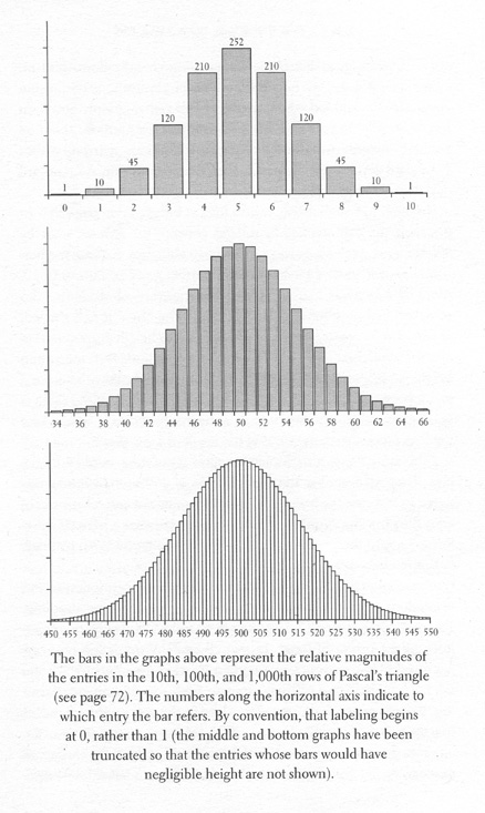 They show an example of 'normal distibution'. To explain this idea Mlodinow writes about an experiment in which 300 students were each asked to guess heads or tails in a series of ten coin tosses. When these results are presented in a graph they form a bell-shaped curve centred on 5 correct guesses. The curve drops to about two thirds of its maximum height between 3 and 4 correct guesses and between 6 and 7 correct guesses and tapers off in a bell shape with 0 and 10 correct guesses having the lowest heights. This type of curve is know as 'normal distribution'.
The graphs below chart the number in rows of pascal's triangle - a chart which can be used to show the number of possible combinations of given set of elements eg the number of ways 100 people can be seated at 10 tables.